
a 7-step checklist for editing in Lightroom
There's a lot that could be said about editing in Lightroom, but I wanted to start off with the basic 7-step workflow that I go through for each and every photo that I work on in Lightroom.
We won't cover applying a preset to your photo, which can be a great way to simplify each of these steps and providing you with a more consistent outcome. I certainly love using presets, but I wanted to cover the basic editing workflow without them, because (1) we want to avoid using presets as a crutch. Let's learn how to use all of the tools for ourselves and then use presets to further enhance our work. Or even make our very own preset that's unique to our eye and style! And (2) these are the basic steps that I take with or without a preset. Even with a preset, you'll still want to walk through this workflow to refine your final product. If you do have a favorite preset, I would recommend starting with steps 1 and 2, applying the preset, and then polishing it up with the last 5 steps.

So let's dive in!
1. Exposure
This is pretty self-explanatory – just slide that handy "Exposure" dial at the top of your right sidebar.
I usually underexpose my photos just slightly to preserve the highlighted areas, so my first step is to bring up the exposure in post-production. Perfecting your exposure before applying a preset will ensure the preset looks as accurate as possible on your image!
2. Warmth
Warmth is obviously affected by your Temperature slider, but I also will occasionally tweak the Tint as well. I find that these two often need to be revisited after I'm done with the next two steps. Once you tweak individual colors, the tint may be off a bit.
Making sure your Temperature and Tint are perfected will also do wonders for your presets!
3. Depth
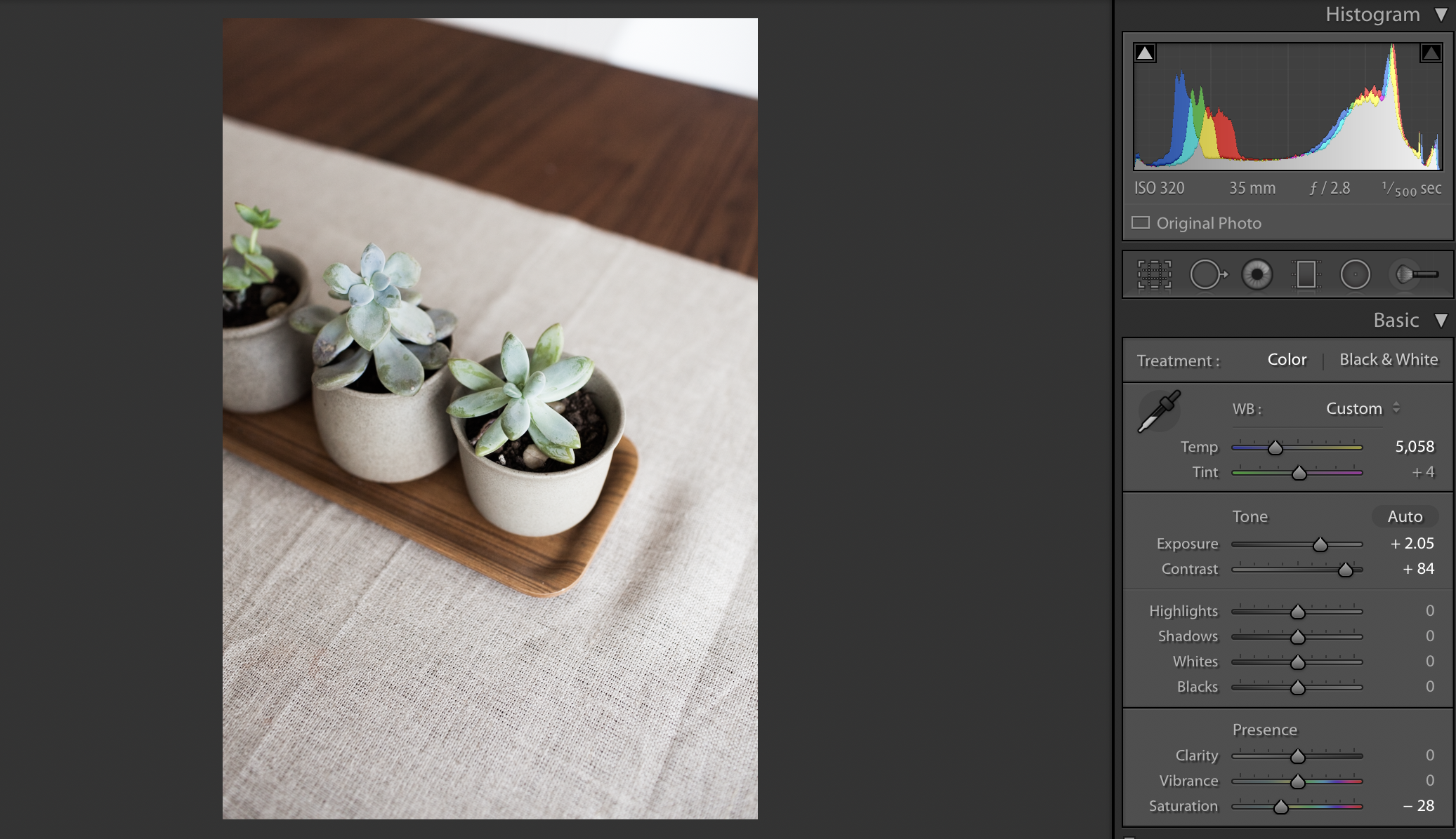
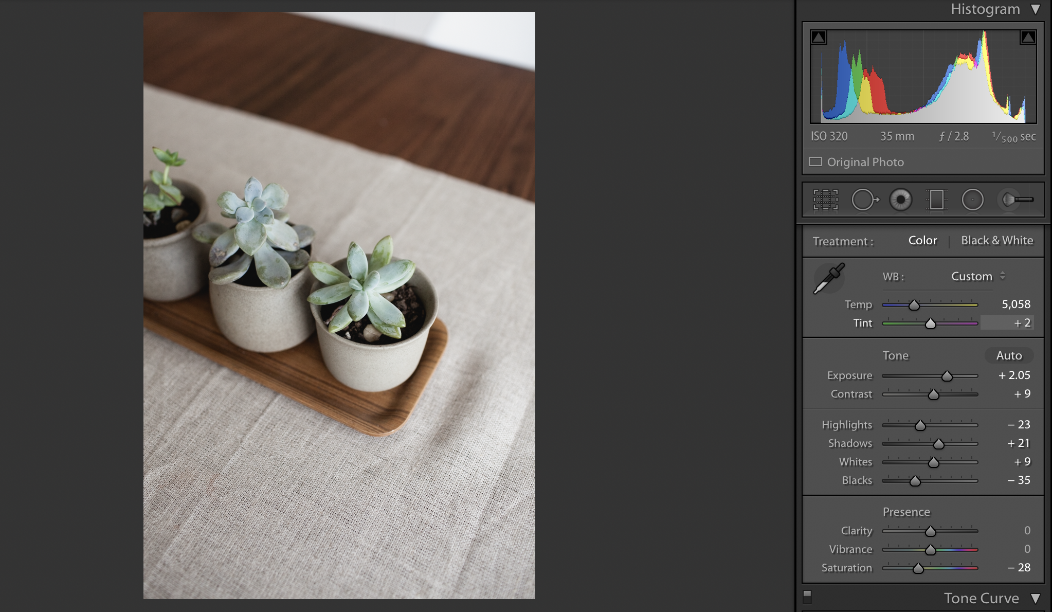
This step encompasses several sliders: Contrast, Highlights, Shadows, Whites, and Blacks, as well as your Tone Curve. These are your tools for accenting the depth of your image.
I would recommend not going too crazy with the Contrast slider, but instead taking more control with your highlight/shadow/whites/blacks sliders. This isn't the most pronounced difference, but below is an example of blasting the contrast slider up (left) versus maintaining more of the details in the highlights and shadows by adjusting the other sliders and tone curve. The tone curve gives you the ability to shape how bright and stark your whites are going to be and how bold or muted your blacks/shadows appear. Have fun experimenting with it!
4. Tones
Knowing how to work with your tones or colors has the power to completely set apart your work and make your images stand out from the rest! It's the factor that lets you interpret the way you uniquely see your images. This is also the section that I find needs the most refinement, even after I've applied a preset.
Bringing down the saturation a bit is usually the first step I take, especially to counteract the extra vibrance that comes when I increase the depth and contrast. But then, if you scroll down to your HSL (Hue, Saturation, Luminance) sliders and Split Toning, you can get into the nitty gritty and decide which colors to tone down and which to make pop, and warm or cool your highlights and shadows separately (depending on your lighting situation).
Personally, I like to bring down the saturation of my greens and blues, draw the hue of my green a bit to the left and the hue of my orange a notch to the right. This is the goldmine for refining your skin tones! Have a model whose skin is looking too green? Try drawing the orange hues more towards the left. Have a client whose face is looking very red or pink? Try pulling the red hues towards the right, to make it a little more orange, and then pull the saturation down a bit.
Just a warning that when you go to the extreme with these sliders, you can get some strange outlines where that color meets with others. So work on finding that sweet spot!
5. Details
This is when I adjust my Lens Correction: check! Then I make sure the sharpening is where I want it, as well as the grain.
You'll notice this checklist just works straight down that right sidebar. Easy peasy!
6. Lines
Now we jump back up to the top to finish things off! You might prefer to do this step first if your image is desperate for a crop or straighten. But I like to revisit this at the end to make sure everything is looking just the way I want it, now that I've got the image levels dialed in.
This where I adjust any angles or cropping. Tip: try to straighten for whatever is in the center of your frame. With a wider lens, the outer lines might not look entirely straight, but you can trick the eye by making sure that the center or focal point is aligned properly!
7. Refine
Lastly, use that spot removal to remove any distracting specks of dust, skin blemishes, or random pieces of tree limb or garbage that bother the eye or take away from your subject. The adjustment brush is another way to refine certain areas of your image, lightening up under the eyes, adding contour to the face, or adding definition to your focal point.
To summarize these 7 steps, I've taken a simple photo and edited it, start to finish, in 4 minutes to show you how I work through this checklist.

Let me know if this raises any questions or frustrations with your editing – leave a comment below! I'd love to dialogue about it!